- About Framing -

- About Framing -
|
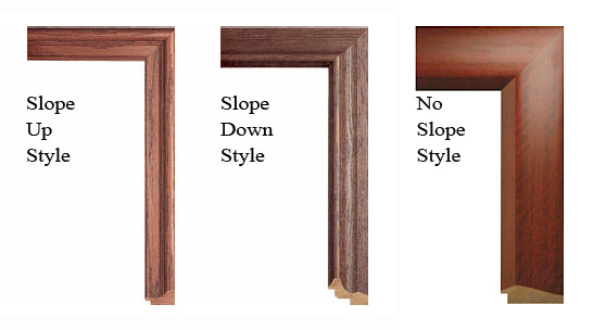
Framing is largely a matter of personal taste, and as subjective as the art it surrounds. If you already know exactly what you want, or have a good relationship with your local framer, then you may not need my advice. If you intend to choose your frame to match the color or decor of a particular room, again, the information below may not be needed. But for those with very little experience with framing who might not be sure what they like, I can offer a few attractive examples that will work well with the artwork available on this site. Artworks on Canvas - Artworks on canvas (original oil paintings and giclee on canvas editions) are not framed under glass, and do not have mattes that surround them, so they need a different framing solution than artworks on paper. There are many styles of frame for canvas artworks, but I definitely prefer the "slope up" or scooped style, rather than the recessed "slope down" or the flat "no slope" styles. There are many hundreds of frame styles available, so I find it is helpful to narrow down the choices by limiting my search to the upward scooping kind of frames. There are many different kinds of surface available also, but I believe natural wood frames are best for nature pictures. |
|
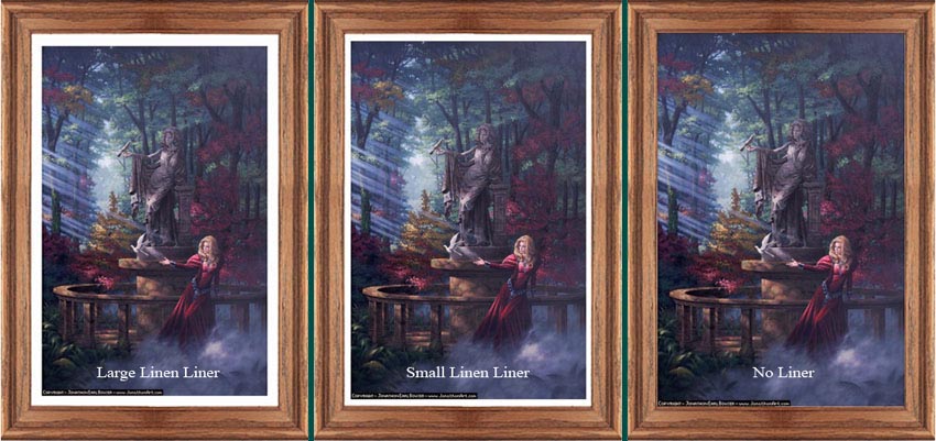
Another feature that I believe really completes a good frame is a linen liner. Liners are a light-colored trim between the painting and the frame, available in larger and smaller sizes, and usually in either a bleached (white) or natural (beige) color. Sometimes the color of the frame might match the color of the painting at a particular spot, causing the 2 to kind of "bleed" together; I prefer a clear distinction between frame and painting, and a liner achives this end cleanly. |
|
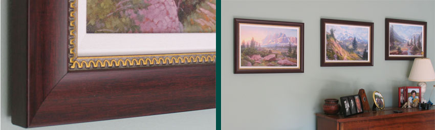
The frames pictured below certainly look like wood, but are actually made of a synthetic material that is very much cheaper than real wood. Not all framers carry this type of frame, and you may not find a style that perfectly suits your taste (the gold trim here is part of the faux-wood frame; I don't dislike it, but probably would chosen this frame without it, if that had been an option) but it's worth asking about if cost is a concern. The linen liners pictured here are optional and do add a bit to the price. |
|
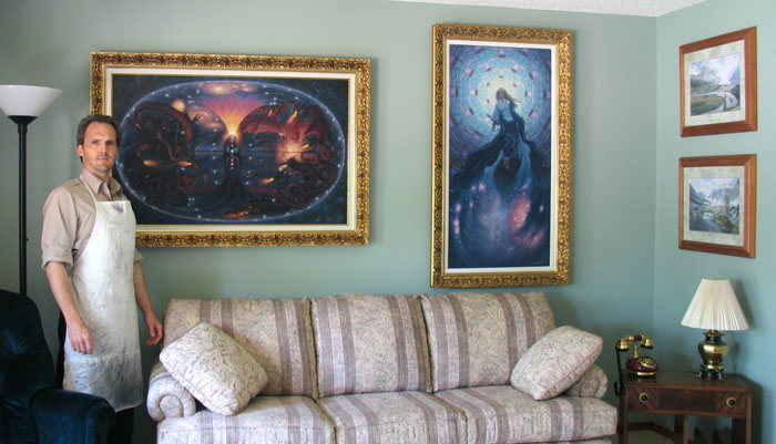
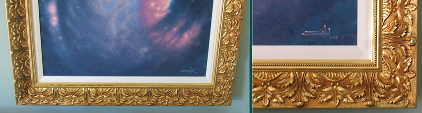
Ornate frames are not for everyone, but I feel they work well for mythological kinds of images. It may be presuming a bit much to think that my work is comparable to the kind of work you see in museums, but one does see mythological paintings in museums, and they are almost always framed in ornate golden frames. When I frame the Mythic Naturalism paintings for myself (like the Fall to Destruction and Rise to Creation diptych pictured below), I always choose an ornate golden frame. It's a more expensive option, but these paintings aren't exactly cheap either... |
|
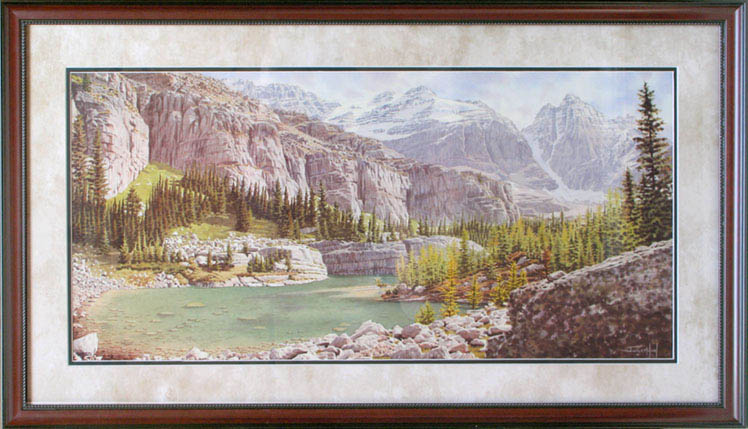
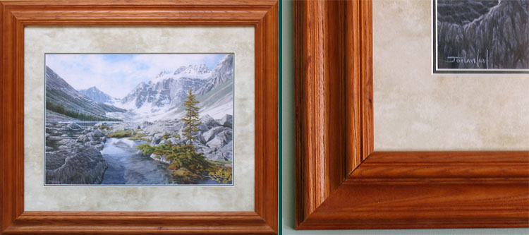
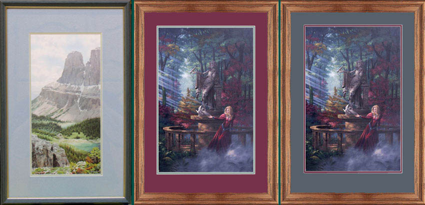
Artworks on Paper - Artworks on paper (original watercolor drawings, lithographs, giclee on paper, etc.) are framed under glass, and do have mattes around them.You'll notice that the frames pictured above are all fairly substantial; a good sized original oil painting can command a frame up to 5 or 6 inches wide. Artworks on paper, however, often have much slighter frames (although not always), with the additional visual weight provided by the matte. Metal frames are comparatively inexpensive, but, again, I prefer wood frames for nature pictures. And if there is wood elsewhere in the house (and there often is), wood frames integrate nicely into the surrounding decor. Mattes, too, provide some challenges: with so many matte color and texture choices, and possible combinations of 1, 2, or even 3 mattes, it can be difficult to know what's best. I prefer a simple approach. One matte seems too simple and 3 mattes seems too busy, so I always choose 2 mattes. My favorite combination is an upper matte with a pleasing marble-texture and an under-matte that borrows a color from the picture. I tend to pick an organic green, but a grey, red, brown, etc. would work just as well. |
|
If the upper matte described above ("Victorian Cameo" - 878559) is not appealing or available, another pleasing option is to choose 2 colors from the picture for the mattes. There are no hard and fast rules about whether the lighter color goes above or below; whichever looks best to you is the correct choice. |
The Entrance Foyer to
The Goddess Art of Jonathon Earl Bowser